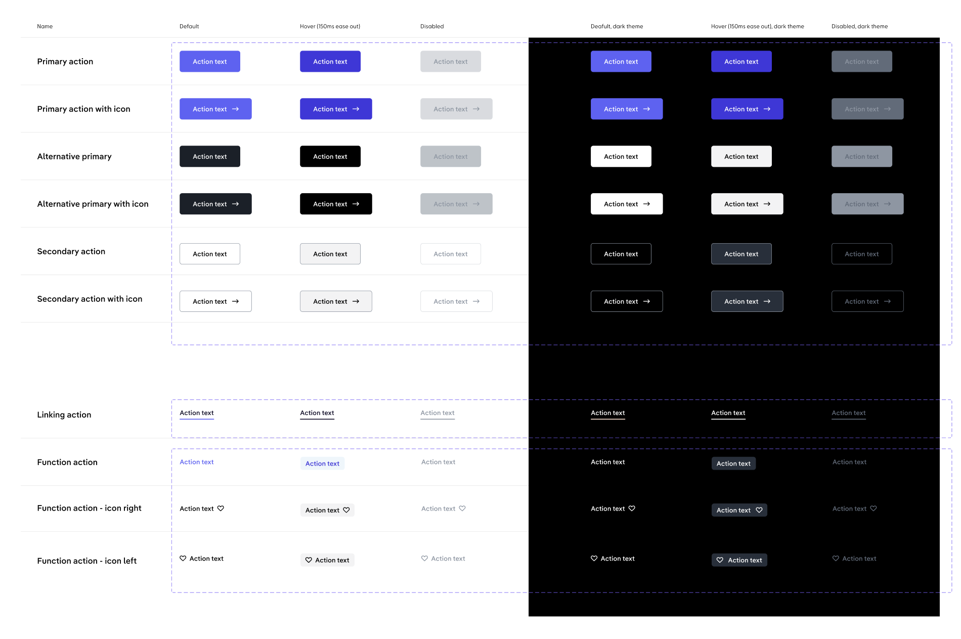
Action buttons allow users to perform an action or to navigate to another page. They have multiple styles for various needs, and are ideal for calling attention to where a user needs to do something in order to move forward in a flow.
An action that is executed locally and immediately.
Hyperlink
A hyperlink that navigates to a different route.
Ansynchronous
An action that is triggered immediately, but takes an unknown amount of time to complete. Check the usage guidelines for more information.
Intents
Primary
Primary buttons are used for the most important call-to-action on the page.
There should only be one primary button in the same layer of user interface.
Primary buttons have a compact mode that is tailored to fit inline use cases and desktop-only environments.
Alternate primary buttons are similar to the primary buttons in the way they work.
They can be used for secondary call-to-actions and might occur multiple times on one page.
Control buttons can be used multiple times in the same interface and are used to control the user flow. For example, in a multi-step wizard, they trigger the step navigation.
Similar to primary and alternate primary buttons, they also have a compact mode.
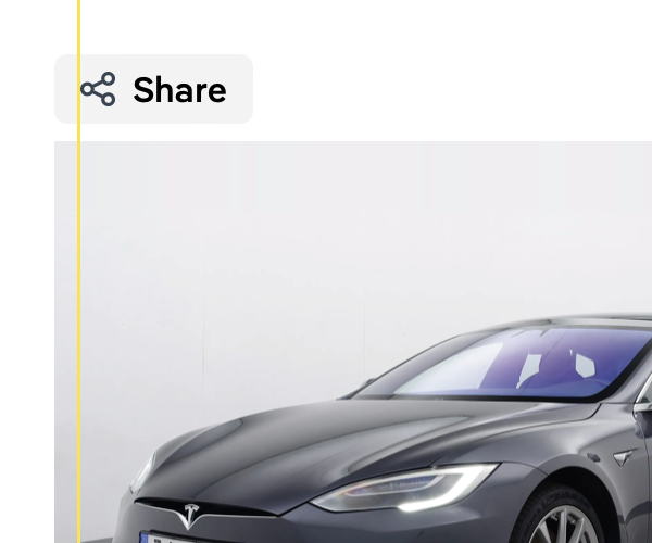
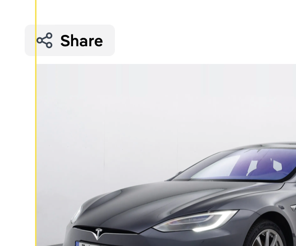
Function buttons are used for actions that trigger some functionality.
For example, they can be used to edit an entry, share a link or download a file.
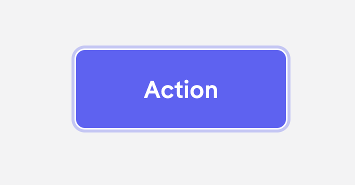
An action button can be navigated using a keyboard. The keyboard focus state adds a blue ring around it. It only shows when a user is actually using the keyboard to navigate.
Label Wrapping
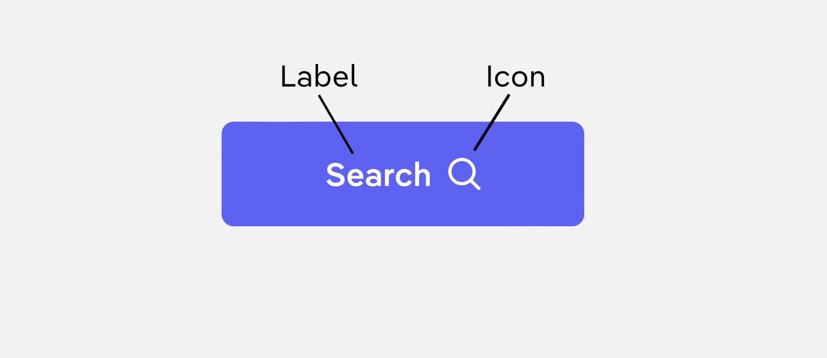
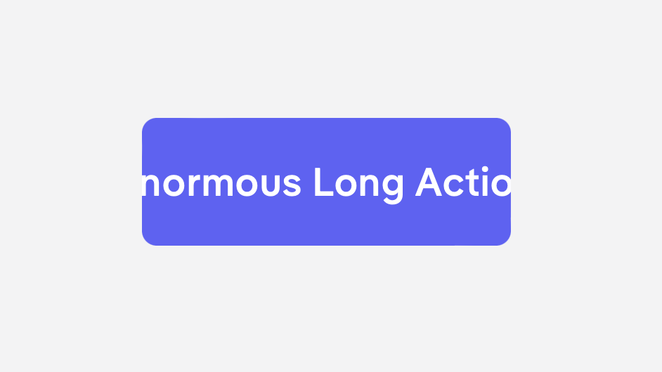
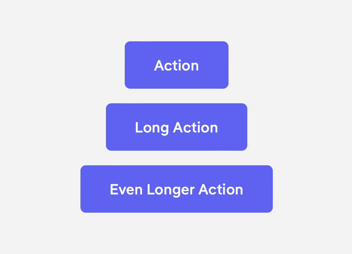
The label does not wrap. If a button is used with an extra long label, we need to make sure to give it enough space to grow or otherwise parts of the label might be hidden.
Flexible Width
The width of a button automatically adjusts to fit the label text. But, by default, primary, alternate primary and control buttons stretch to their container.
Usage Guidelines
Icons
tbd.
Spacing
Groups
tbd.
Forms
tbd.
Containers
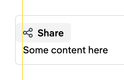
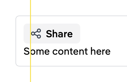
When function buttons are used at the edge of a container, outer spacing should be considered.
We do not want the button to touch the container boundaries, but we also want to keep the alignment in place.
Bad
Bad
Good
Alignment
Horizontal
tbd.
Vertical
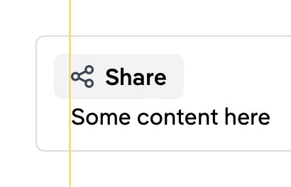
Function buttons ignore their outer spacing and align based on the text instead.
Bad
Good
Ansynchronous Actions
tbd.
Forms
tbd.
Content
tbd.
Keyboard Interaction
Key
Interaction
Space
Enter
Execute the button action. The focus remains on the button except if the button opens or closes the current container. In this case, the focus moves to the target or back to the caller.
API Reference
No API reference available.
Configuration
If you're working with Next.js, make sure to add the