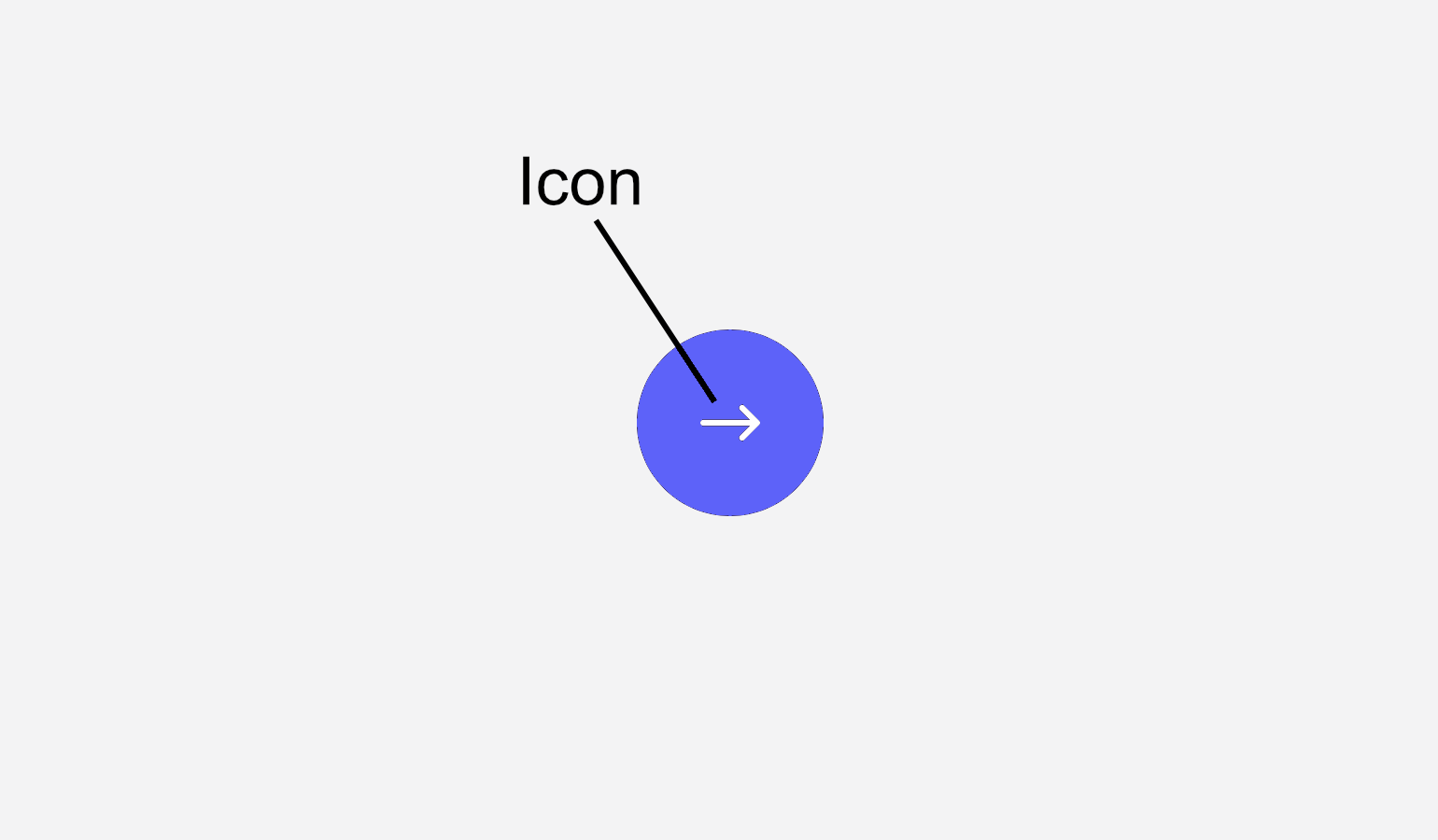
FloatingActionButton
Dark Mode
Accessibility
Floating action buttons (FABs) are buttons that provide quick actions indicated by only an icon.
They primarily appear on a different layer on top of the interface hence the floating.
Anatomy
Actions
Type | Support | Description |
|---|---|---|
Synchronous | An action that is executed locally and immediately. | |
Hyperlink | A hyperlink that navigates to a different route. | |
Ansynchronous | An action that is triggered immediately, but takes an unknown amount of time to complete. |
Intents
Primary
Primary Alternate
Control
Function
Behaviour
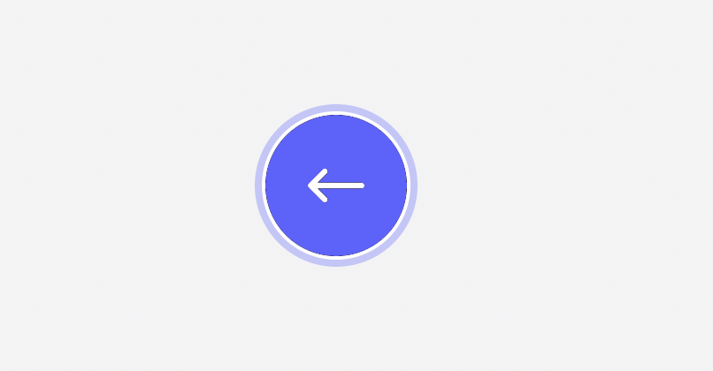
Keyboard Focus
A floating action button can be navigated using a keyboard. The keyboard focus state adds a blue ring around it. It only shows when a user is actually using the keyboard to navigate.
Usage Guidelines
tbd.
Accessibility
Floating action buttons must always provide a
labelKeyboard Interaction
Key | Interaction |
|---|---|
| Execute the button action. The focus remains on the button except if the button opens or closes the current container. In this case, the focus moves to the target or back to the caller. |
API Reference
No API reference available.
Changelog
08. May 2023
- added hover & active state to buttons
- added primary-alternate, control & function as intents
- improved colors a bit (e.g. different shade of blue)
11. November 2022
- renamed ActionButton to FloatingActionButton
- fixed inconsistent sizing of disabled buttons